
You know when you’ve been doing something for a long time and it gets ingrained? For me, that’s infographics. I’ve created a lot of chartage during my career.
Take a look: Here’s me when I started at the New York Times, where I was a graphics editor. I worked there for 15 years, on all the news desks, with the investigative team, and ran the biz section graphics desk.

The middle i.d. is my stint at Fortune Magazine, where I was the Infographics director and got to work with the awesome folks at CNNMoney.com (I’m fading!). And here’s me now, working for Mr. Rupert Murdoch at the Wall St. Journal. Guess graphics make you gray. :)
Anyway, when a colleague asked me to write about what I do, it was kind of arresting, like the time that Montana patrolman intercepted my husband doing 94 on a long stretch of highway. Forced me to pause.
So here I am, pulling over. I’m going to deconstruct some of what I know and share my 7 ½ Secrets to Successful Infographics. Get comfortable. Get a cup of coffee. (Get me one while you’re at it?) Feel free to read this in any order you like. Or if you’re lazy, I mean busy, just read some of it. But keep this link around, because you never know…
1. Have an idea
Where does one procure an idea?
Usually they’re found in the shower. Or at 3 a.m. in the middle of a restless sleep. So if you don’t have a clue what you want to make a graphic about, I’d suggest having a good scrub and going to bed, though not necessarily in that order.

Don’t wake up with an idea? Here are some thoughts from the media outlets I’ve worked for:
Our stories are driven by the news, so our graphics are framed by ‘what’s new’ and sometimes ‘what’s different’ and hopefully, ‘what’s relevant.’ Editors have put their glasses on the tops of their heads and said things to me like, "Our job is to inform and delight our readers." That’s a nice beginning.
I’ve also heard, "What we’re doing here is trying to increase The Traffic," my response to which is, that pretty much limits us to focusing on a) sex b) violence c) cute animals d) Steve Jobs or e) all of the above in some twisted combination. I’m not even going to go there.
Here’s a list I kept to amuse myself when I first started working for Time Inc/TimeWarner, CNN’s parent company:

Anyway, new, relevant, different, informative and even entertaining are good places to start. If you’re seized by an idea or have a story busting out of you, even better. But if you’re not sure what to pursue, I suggest you tell me something I don’t know or reveal something I couldn’t otherwise find. Teach me or wow me, but don’t cover ground that’s well-tread.
The best way to figure out what your story (aka your infographic) is? Get really honest and ask yourself, "What’s the sexiest part of the task ahead of me?" If you don’t want to spend time with your graphic, no one else will, either.
Ok, so you’ve got your idea. Or maybe you’re stuck executing someone else’s. Proceed to step two.
2. Get data
How is this done? I just dial the phone, say, "Hi, this is Sarah Slobin from (insert important-sounding news organization here.) I need data for this story we’re working on and if I could have that in the next hour or so, that would be really great because I’m on deadline…"
It totally works.
Not helpful, is it?
Let’s try again.
Where do you find data?
Lucky for you, big data has hit critical mass and data viz is in. These days, you can’t swing a cat without hitting a web evangelist who says datageeks are ninjas!!! And because transparency is the new black, everyone is giving away numbers.
Here’s the chicken and egg part: before you can find data, you have to know a little about what you’re looking for. And no, this doesn’t mean just google your topic and read the wikipedia entry. Buck up. You have to approach your subject matter academically and do some research. If you can’t face that, approach an academic.

Track down a professor type and tell her you’re looking for an expert who’s super-smart about your topic. People love to be experts and if they’re not, they’re jealous of people who are and will know where to find them. Be patient. These folks keep wacky office hours.
Can’t find an academic? Look for a scientist. Scientists are used to explaining things, since most of us slept through AP chemistry (or elected history of film instead.)

Can’t find a scientist? Try a government agency like data.gov, census.gov or bea.gov. Here’s a hint: if the name is ‘Bureau of Labor Statistics’, someone is sitting on metrics.
Government got you down? Try non-governmental organizations. Examples of NGOs are the U.N., the IMF, OECD or EUROFRTTPLF. (Kidding on the last one, acronyms get torturous.)
The truth is, digging up data takes focus. You have to chase it, just like my dog Sketch when she sees a pigeon.
Do, however, be mindful of your source. I’m told there are these people with "agendas" and, like crossing the street, you can find them to the "left" and to the "right." I hear these folks take data and twist it like balloon animals, so beware—those things always pop before you get them home.
3. Tools, and brandishing them
Say you’ve got a bunch of numbers, or a bevy of statistics, or a gaggle of geese. First: nix the geese; they poop everywhere. Now what? It’s time to fall in love (or at least get real intimate) with your material. Maestro, cue the romantic music.
This is where you get to choose your tools. I know, I know: our socks outlast our operating systems these days, so you want to know what the latest cutting edge program for data viz is, right? Ok, I’ll tell you.
Some people work in Excel. Some people work in R. Some of you love your D3 to death. Processing, Illustrator, Tableau—it’s all good. None of them are perfect, of course. But which is the best? I’ll let you in on a trade secret: there’s only one program you need to know if you’re serious about infographics. This is crucial, so listen up and you too can be a data viz star:
Not!
It’s not the paintbrush that produces a work of genius; it’s the genius, right?
And ok, I know the Harvard attitude in the cubicle next to you is always waving some elegant little snippet of code in your face and throwing around six-syllable words, implying you’ll never catch up. Don’t play that game. No one wins. I’m letting you off the hook for being an expert on every new program.

(Yeah, it’s Britney Spears the day she discovered her ponytail looks like a little fountain.)
My friend Dona Wong, who wrote the book on infographics, (ok a,book, but still) told me about an intern of hers who was fresh out of college and worrying his skills would atrophy while the kids back at school were learning new technology. Look, it’s lovely to have a Swiss army knife, but how many of you have actually used the little scissors? Learn one thing and do that well. If you’ve got a set of tools you can wield like Jackie Chan, go for it. If not, choose something that fits you comfortably and stick with it until you get good. Wax on. Wax off.
4. Scrub your data
Because working with data is truly unpredictable, I’ve developed a form of selective amnesia that allows me to cope. Every time I start a graphic, I’m optimistic that my material will show up perfectly packaged with a lovely bow and some chocolate covered pretzels in a cellophane bag. Instead, it usually arrives like the black sheep cousin at a family wedding—late, disheveled and smelling like something stuck to the bottom of a cat’s feet.
Before you can visualize anything, you’ve got to make sure your material is clean, clean, clean and super-organized. If you don’t have an obsessive-compulsive personality now is a good time to develop one. My friend Archie Tse at the Times spends a huge amount of time massaging his data, making spreadsheets that are works of art in themselves. Then he pops out heart-achingly beautiful graphics in like thirty seconds. It makes me crazy.
I’m pretty sure Archie stole this secret from this guy Abraham Lincoln. Lincoln said something like, "Give me six hours to chop down a tree and I will spend the first four sharpening the axe." (Full disclosure: I missed that conference call so I can’t confirm this exact quote.)
There are myriad payoffs to having clean data. You can expect that at some point during your project, you’ll run out of bandwidth, or someone will look over your shoulder and say, "Hey, what’s that spike there, is that a mistake?" When that happens, you’ll be grateful your numbers are in solid shape.
Here’s where I remind you to always practice safe charting. Don’t work on the original data. Instead, keep a copy of it. That way you get a do-over if you have an uh-oh moment and insert a mistake.
5. Get Freudian
Now you’re ready to make charts. What’s next? You need to deeply understand your data. Here’s how I do it:
At the beginning of each graphic, I spend some time just staring without comprehending anything. I used to feel bad about this, like I was wasting time, until I realized its part of what they call "process."
So after I finish wasting time…
No, actually. If I stare at my spreadsheet (or table or daunting stack of white papers) for a while, I start to get it. I read it in small bits and go forward and backward randomly until something clicks. Did you ever look for the Ninas hidden in a Hirschfeld drawing? Ok, how about Where’s Waldo? Better reference? Once you find what you’re looking for, you can’t not see it.

You may want your data to tell a certain story, or think that it tells a certain story, but you must respect what the numbers actually say. Statistics are a little like anarchists: if you force them to stay in line, you’re begging for trouble. It’s crucial that you understand what the information in front of you says. This will guide your process.
When I was at the NYT, there was this reporter who drove a thousand miles across country chasing this thesis that population growth was sparked near off-ramps on the interstate. It was a lovely road-trip story; he gathered amazing anecdotes and the editors loved it. Except that when we mapped the census data it didn’t support the thesis. Imagine how much gas he could have saved had he started by looking at the data.
If you’re new to data viz, go slow. Start small. Look at the superlatives first. Find the largest number and compare it to the smallest. See how nicely your charts curve in the middle when you plot them in a fever line or a bar chart. Or look for the jagged rise and deep fall of the information, which you’ve probably seen if you’ve got your hands on something like, oh say, recent market data from anywhere on the planet.
Once you’ve got your head wrapped around what you’re sitting on (I know, that’s not physically possible), you can choose a charting form.
6. Let’s play
And now, the fun part.
Classic western: Desperado, Antonio Banderas circa 1995. A guitar, a ponytail and a gun. He’s standing on the dusty road flanked by his compadres. The bad guys pull up in a limo. He’s calm, he’s un-phased, he cracks his neck, stares deadpan into the camera and says (read with Spanish accent), "Let’s play."

This is you! You’re Antonio Banderas! The data are the bad guys! No, I don’t mean you should shoot your statistics with a guitar case/rocket launcher, but at the beginning of every process there’s always a chance to play it straight or play. I choose play.
"With charts?" you say, rolling one eye and keeping the other on your tweeting thumb. Yes, my friend. With charts.
Look around. The growing world of data viz means there’s new and inspiring work being posted every day. From Facebook to Flickr to Feltron to Fry to Flowing Data, expression-by-infographic is everywhere. And guess what? If you gather up work you find compelling, you can keep it and use it as "reference." "Reference" is that thing that helps you think about what charting form to use. It changed my life.
I used to think ideas were supposed to just pop out of your head, or that good artists should be able to draw anything. ("A wheat thresher? Why of course, Bob, it looks something like this…") Then I learned that even my husband, a gifted illustrator (www.ericpalma.com), uses reference to spark ideas. (I’m not exactly sure what he was browsing when he made this Cheney drawing….)

It never occurred to me that you don’t have to make it up all by your lonesome. Reference! You can use it for…inspiration!
Look, this rise of infoviz—we’re not inventing something new. Sure, the web means we can make an interactive with big data we’ve collected on how often we e-mail gramps. But did you know that gramps was browsing Fortune magazine infographics back during World War II?
Florence Nightingale? She died a century ago. She made charts. Look it up.
Need inspiration? Go old school. Check out Chris Mullen’s archives of visual storytelling. See what moves you.
7. Edit thyself
Ambitious?
Fabulous.
Got a lot to say?
Cool.
Really excited about your data?
Excellent.
Frame your idea clearly. Take a disciplined approach to visual storytelling. Your primary point should be clear and supported by context and detail. The main art should draw us in. Sidebars should be well-focused. Don’t spam us with too much information; nobody has time these days.
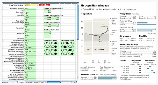
Sure, you can go deep on the web, but let’s be realistic—according to my last Omniture search, users spend only 4 ½ minutes with online calculators on average. And with calculators they have an agenda, like seeing how much is left in checking after they buy a new Xbox! Graphics are meant to be fast, visceral and easy to digest. Here’s one I did on the day of a big candy company merger:

(Be kind; I did this in 6 hours on deadline.)
½. Respect the asterisk
When you were in middle school, did you ever do that 10-step exercise where step 1 is "read all the instructions before you start" and step 10 is "ignore instructions 2 through 9?" If you were like me, you ignored step 1, picked up your pencil and knocked-out 2 through 9, thinking you were a smarty-pants who was going to beat all the goody-two-shoes rule-followers. (I’m Spanky in this picture.)

Except the exercise was allll about attention to detail. Or tormenting students.
Making an infographic is one time when you must read the small print. If you get all the way through making the chart, pitching it to your boss, showing it off to your colleagues and then discover in the footnotes of the metrics that the methodology has changed and the numbers aren’t comparable… Well, you’re screwed.
Working with data requires a certain degree of rigor. Just does.* Make sure you know what the asterisk is connected to and suffer through the small type. There’s gold in there. Companies don’t disclose the jet they gave the CEO in the executive summary at the front of the report; they stick it in the footnotes four pages from the end.
Speaking of the end, you made it! Congratulations.
To recap, nap a lot. Have more coffee. Or if you’d like, friend me and send me what you’ve found and we can chat. It’s been kind of nice pulling over and talking about infographics. I thank you for sticking around.
(Looking for the footnote? Good for you. I’ve left it out. My gift to you for paying attention. Now you know what the ½ in the title means.)